
Get
Get
Get
Found
Found
With ZenChange Marketing
With ZenChange Marketing


Feel Proud.
Your online presence should be as great as your business.
Measure Results.
Measure Results.
Each month we review performance and give you personalized recommendations.
Stop Guessing.
Stop Guessing.
Our strategies are backed by experience and deep analytics.

We're looking for clients
for life.
No long-term contracts.
We let our work speak for us.
Wine & Spirits
Legal
Healthcare

Cannabis
website


Branding

Social Media

Blog

Social Media

website


Branding

Social Media

Blog

Social Media

website


Branding

Social Media

Blog

Social Media

website


Branding

Social Media

Blog

Social Media

We're looking for clients
for life.
No long-term contracts.
We let our work speak for us.
Wine & Spirits
Legal
Healthcare

Cannabis
website


Branding

Social Media

Blog

Social Media

website


Branding

Social Media

Blog

Social Media

website


Branding

Social Media

Blog

Social Media

website


Branding

Social Media

Blog

Social Media

We're looking for clients
for life.
No long-term contracts.
We let our work speak for us.
Wine & Spirits
Legal
Healthcare

Cannabis
website


Branding

Social Media

Blog

Social Media

website


Branding

Social Media

Blog

Social Media

website


Branding

Social Media

Blog

Social Media

website


Branding

Social Media

Blog

Social Media

Marketing Strategy
Website
Social Media
CRM
Our Services
Stop guessing about your marketing.
Although diving right into marketing may seem tempting, planning typically leads to better results in the end. It’s not uncommon for us to speak with small business owners about their marketing and hear comments like, “I tried Adwords for a while but it didn’t work for me”, or “I’ve been trying some things on social media but I’m not sure that I’m doing it right.”



Marketing Strategy
Website
Social Media
CRM
Stop guessing about your marketing.
Although diving right into marketing may seem tempting, planning typically leads to better results in the end. It’s not uncommon for us to speak with small business owners about their marketing and hear comments like, “I tried Adwords for a while but it didn’t work for me”, or “I’ve been trying some things on social media but I’m not sure that I’m doing it right.”


How it works
Talk to us
Get a free marketing plan
Launch Your Plan
Get a Makeover
Get Found
Get Leads
Our results.
Our results.
Hear what our clients have to say about out team and our services.
Hear what our clients have to say about out team and our services.
Dr. Fernando Mendoza
CEO @ Scrivas
Dr. Fernando Mendoza
CEO @ Scrivas
Dr. Fernando Mendoza
CEO @ Scrivas
Joe Calvin
Southern Crop
Joe Calvin
Southern Crop
Joe Calvin
Southern Crop
Moises Saltiel, ESQ
Founder @ Saltiel Law Group
Moises Saltiel, ESQ
Founder @ Saltiel Law Group
Moises Saltiel, ESQ
Founder @ Saltiel Law Group
Brandy Abreu, ESQ
AM Law
Brandy Abreu, ESQ
AM Law
Brandy Abreu, ESQ
AM Law
Moncy Blanco-Herrera
RRBH Law
Moncy Blanco-Herrera
RRBH Law
Moncy Blanco-Herrera
RRBH Law
Bob Flynn
Co-Founder @ Curious Cork
Bob Flynn
Co-Founder @ Curious Cork
Bob Flynn
Co-Founder @ Curious Cork
Alec Pagliaro
CRO @ Southern Crop
Alec Pagliaro
CRO @ Southern Crop
Alec Pagliaro
CRO @ Southern Crop
Fanny Hanono
GFX
Fanny Hanono
GFX
Fanny Hanono
GFX
Helena Farber
Farber Law
Helena Farber
Farber Law
Helena Farber
Farber Law
Tom Mauri
Development Project Executive @ Quadra
Tom Mauri
Development Project Executive @ Quadra
Tom Mauri
Development Project Executive @ Quadra
Dios
GFX
Dios
GFX
Dios
GFX
Alec Pagliaro
The Half Oz
Alec Pagliaro
The Half Oz
Alec Pagliaro
The Half Oz
Responsiveness, initiative, smart, on trend, beyond competent. Most importantly, ZenChange has heart. Diane and her team are amazing and are helping me get my business to where I have always dreamed it could be. Don’t walk, run to hire the secret to your future success... ZenChange!
Marcia Hansen, ESQ
Shareholder @ Hansen Law
Diane’s involvement in our services environment has arguably been the highlight of this engagement. Her sense of ownership, pragmatism, urgency and thoroughness are equal to those evidenced by my own senior team. Diane’s performance in support of my customers is an unequivocal differentiator of the firm and it’s people.
Sean M.
I can’t tell you how many times I have gone back to the Buyer Personality Profiles you created when making decisions about my business. They are really helpful!
Cindy R.
I can’t tell you how many times I have gone back to the Buyer Personality Profiles you created when making decisions about my business. They are really helpful!
Cindy R.
I can’t tell you how many times I have gone back to the Buyer Personality Profiles you created when making decisions about my business. They are really helpful!
Cindy R.
I am so impressed and happy with the site! Every page amazed me. Thank you SO very much!
Debra G.
Founder @ Plex
I am so impressed and happy with the site! Every page amazed me. Thank you SO very much!
Debra G.
Founder @ Plex
I am so impressed and happy with the site! Every page amazed me. Thank you SO very much!
Debra G.
Founder @ Plex
This offer may be the single best decision a business owner can make this year. Diane Moura and her team are the premier, focused and constant source for Social Media Marketing and corporate branding in the US.
Armando Paz
This offer may be the single best decision a business owner can make this year. Diane Moura and her team are the premier, focused and constant source for Social Media Marketing and corporate branding in the US.
Armando Paz
This offer may be the single best decision a business owner can make this year. Diane Moura and her team are the premier, focused and constant source for Social Media Marketing and corporate branding in the US.
Armando Paz
The Zenchange team has completely changed the complexion of our outreach to potential clients. They’ve put us in a high regard in the industry and we’re very appreciative. We’re very happy with the way Zenchange has worked for us.
Tom Mauri
CEO @ Quadra Consulting
The Zenchange team has completely changed the complexion of our outreach to potential clients. They’ve put us in a high regard in the industry and we’re very appreciative. We’re very happy with the way Zenchange has worked for us.
Tom Mauri
CEO @ Quadra Consulting
The Zenchange team has completely changed the complexion of our outreach to potential clients. They’ve put us in a high regard in the industry and we’re very appreciative. We’re very happy with the way Zenchange has worked for us.
Tom Mauri
CEO @ Quadra Consulting
Load More


Our work.
View how we've helped brands like yours.
Increase in organic web traffic from SEO
172%
PPC cost to deliver high converting leads
Saved 40%
Custom Plumbing
Home Services Marketing

Increase in organic web traffic from SEO
172%
PPC cost to deliver high converting leads
Saved 40%
Custom Plumbing
Home Services Marketing

Increase in organic web traffic from SEO
172%
PPC cost to deliver high converting leads
Saved 40%
Custom Plumbing
Home Services Marketing

Organic Impressions in 6 Months
37K
Email open Rate
70%
Curious Cork
Wine & Spirits Marketing

Organic Impressions in 6 Months
37K
Email open Rate
70%
Curious Cork
Wine & Spirits Marketing

Organic Impressions in 6 Months
37K
Email open Rate
70%
Curious Cork
Wine & Spirits Marketing

New Product Brand Launches
Logos, Packaging & Strategy
Southern Crop
Cannabis Marketing

New Product Brand Launches
Logos, Packaging & Strategy
Southern Crop
Cannabis Marketing

New Product Brand Launches
Logos, Packaging & Strategy
Southern Crop
Cannabis Marketing

Complete Rebrand & Audience Building
Sales Increase in 3 Months
3x
The Half OZ
Cannabis Marketing

Complete Rebrand & Audience Building
Sales Increase in 3 Months
3x
The Half OZ
Cannabis Marketing

Complete Rebrand & Audience Building
Sales Increase in 3 Months
3x
The Half OZ
Cannabis Marketing

Brand repositioning before & after COVID
Social Media Engagement on AI SaaS Brand Launch
+120%
Scrivas
Healthcare Marketing

Brand repositioning before & after COVID
Social Media Engagement on AI SaaS Brand Launch
+120%
Scrivas
Healthcare Marketing

Brand repositioning before & after COVID
Social Media Engagement on AI SaaS Brand Launch
+120%
Scrivas
Healthcare Marketing

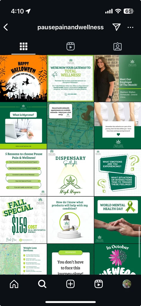
Complete brand launch
Market Share in Medical Card Clinic Market in MS
70%
Pause Pain & Wellness
Cannabis Marketing

Complete brand launch
Market Share in Medical Card Clinic Market in MS
70%
Pause Pain & Wellness
Cannabis Marketing

Complete brand launch
Market Share in Medical Card Clinic Market in MS
70%
Pause Pain & Wellness
Cannabis Marketing

Complete brand launch
Organic Impressions / Month
150K
RRBH Law
Legal Marketing

Complete brand launch
Organic Impressions / Month
150K
RRBH Law
Legal Marketing

Complete brand launch
Organic Impressions / Month
150K
RRBH Law
Legal Marketing

Meet Our Leadership Team

Now it's your turn to get found.
The bar is higher in marketing these days. You need to be an artist, tech nerd, psychologist, strategist, social wizard, videographer and author to get found. Only 50% of small businesses survive more than 5 years yet 47% of small business owners handle their own marketing. Coincidence?
Why Should I DIY my Marketing?
It's cheaper
I don't have time to give a marketing agency direction
I'd rather hire a person in house
I'm too small
I don't know where to start
My sister said she could do it for me
I already have someone doing my marketing
It's cheaper
I don't have time to give a marketing agency direction
I'd rather hire a person in house
I'm too small
I don't know where to start
My sister said she could do it for me
I already have someone doing my marketing
It's cheaper
I don't have time to give a marketing agency direction
I'd rather hire a person in house
I'm too small
I don't know where to start
My sister said she could do it for me
I already have someone doing my marketing

Download our free ebook for your recipe to get found:
Download our free ebook for your recipe to get found:
5 Things Your Website Must Have
5 Things Your Website Must Have

Download our free ebook for your recipe to get found:
5 Things Your Website Must Have
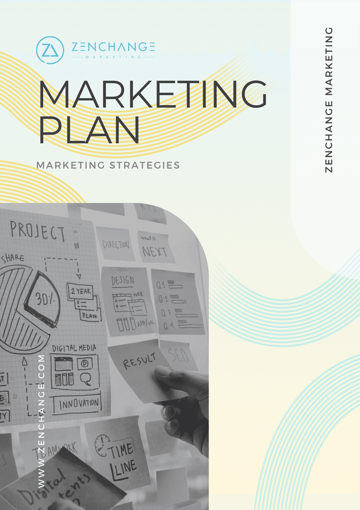

Limited Time Offer
Free Marketing Plan
Get a Free Marketing Plan that will help you skyrocket your business!
Identify your Target Market
Identify your ideal customers, their needs, problems and values.
Target Your Ideal Customers
Utilize market research to map out a strategy to reach your target audience.


Road Tested Marketing Strategies

Ruby Digital and ZenChange Marketing form a strategic alliance in Florida
May 5, 2025
Marketing
Online marketing

Ruby Digital and ZenChange Marketing form a strategic alliance in Florida
May 5, 2025
Marketing
Online marketing

THE FACTS Personal Branding For Attorneys
Apr 27, 2025
Online marketing
Marketing
Brand Development

THE FACTS Personal Branding For Attorneys
Apr 27, 2025
Online marketing
Marketing
Brand Development

PREVIEW Medical Practice Marketing Moves For Physician Owners Now
Apr 21, 2025
Marketing
Online marketing
SEO

PREVIEW Medical Practice Marketing Moves For Physician Owners Now
Apr 21, 2025
Marketing
Online marketing
SEO
Load More

Ruby Digital and ZenChange Marketing form a strategic alliance in Florida
May 5, 2025
Marketing
Online marketing

THE FACTS Personal Branding For Attorneys
Apr 27, 2025
Online marketing
Marketing
Brand Development

PREVIEW Medical Practice Marketing Moves For Physician Owners Now
Apr 21, 2025
Marketing
Online marketing
SEO

ESSENTIAL Law Firm Marketing Priorities In A Down Economy
Apr 18, 2025
Marketing
Online marketing
SEO
Load More


Marketing AI, Best Practices, and Getting Found
No spam, just good quality stuff.


