At some point when selling your services, you will likely be asked to deliver a formal or informal presentation, whether in person or on Zoom. Perhaps you will be invited to speak at a conference as an expert, or more informally at your local networking group as an introduction. This naturally raises the question, “should I use visual aids?”. To which the answer must be “it depends”. It depends upon your dynamism as a speaker, on the complexity of the topic, on the setting in which you will deliver your talk, whether visual aids will save you words (i.e. showing vs. describing), if the impact of the visual aids will be greater than the spoken word, and on the importance of relationship building during your talk. Probably (and somewhat unfortunately) the most popular form of visual aid is the Powerpoint presentation. During my years in Corporate America I can’t count the number of slides I endured…um, I mean saw, and in fact, I feel most grateful to be able to write to you today and to not have completely succumbed to “death by Powerpoint”. And I say this as a consultant, so it was a close call. Boy, do we consultants ever love our Powerpoint! I was once involved in a Powerpoint presentation in Argentina that lasted an entire day! Sadly, I was one of the presenters and I still feel guilty about what we did to that poor client. So writing from the perspective of best practices, and being on both sides of successful and unsuccessful presentations for more than 3 decades, here are some of the traps of using Powerpoint:
“Thinking” in Powerpoint - When you know you have to give a talk, if the first thing you do is to open Powerpoint, then you’re starting off all wrong. I can guarantee you will end up with way too many slides that will look way too busy.
Writing complete sentences on slides - A good slide should follow the 3 second rule of advertising. The audience needs to understand its meaning in 3 seconds. It is a visual AID, not the presentation itself. If your audience is reading the slide, then they aren’t listening to you. Humans cannot multi-task as much as we might like to think we can.
Poor design - Boring images, too many or inappropriate fonts (please don’t use Comic Sans in a business presentation…), lack of visual alignment and too little white space are just some of the common design mistakes made by presenters. They are distracting to the audience and will undermine your message.
Talking to your slides - This one is my personal favorite blunders and I’m sure you have seen it too. Rather than using slides as a visual aid and rehearsing their presentation so they know the content, the presenter instead puts all of their content up on their slides, and even if they don’t read it word for word, they use it as Cliff Notes to remember what they wanted to say, thus looking at the slides rather than the audience. So what does the audience do? They look at the slides too, reading along and becoming frustrated if you aren’t speaking as quickly as they are reading.
Putting entire lists on the same slide - If you intend to list 5 reasons for something and put all 5 reasons on the same slide without transition effects, then when you are explaining reason #1, your audience will have already read reason #5 and be bored.
It’s dark (more of a fact than a blunder and clearly this only applies if you’re presenting in person) - I was once involved in a marathon Powerpoint presentation that carried over from the morning until after lunch, and when we turned out the lights so the audience could see the slides, one of them actually fell asleep! The trouble with using slides is that the room must at least be dimmed, which reduces your ability to maintain eye contact with your audience, and increases the likelihood that they will be sneaking peeks at their smartphones under the conference table, snoozing, or otherwise not giving you their full attention.
Have you ever seen a U.S. President use Powerpoint during his inaugural address? When Tony Robbins gets up on a stage to motivate 1000s of people, he never takes his eyes off of them. Do you see him looking at a Powerpoint? Now I’m not saying that you should never use Powerpoint. If your message is complex and requires a diagram then by all means use slides. If you want to evoke emotion (and you should) and an image would help do that, then use slides. If you are speaking to a large room where eye contact with everyone is impossible and you would like some visual aids, then use slides (maybe). But, do consider these best practices when constructing your slides:
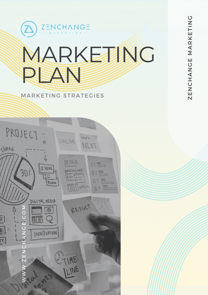
Construct a storyboard outside of Powerpoint - This is the secret of some of the greatest presenters as it allows you to play around with flow before ever investing your energy into building a slide. Here’s how to do it:
Start with the main idea of your presentation and a stack of sticky notes. What is the ONE THING you want your audience to remember if they recall nothing else? Tell them that right up front. That is your first sticky note. Remember to use “you” related words so you are speaking directly to the audience.
Break that main idea into sub ideas that will form the flow of your presentation. Write one sub idea per sticky note and put them up on the wall in order.
Now play around with the order until you are comfortable that it flows well. Eliminate any sub ideas that are not critical to supporting the main idea. This would be a great time to get help from a trusted colleague to test out the flow of your message.
Using different colored sticky notes, write down what you will use to reinforce each sub idea. It could be a chart, graph, image, or just a story that you will tell.
Remember your conclusion - and reinforce your main idea again. That will be your last sticky note.
Now you have your outline for your presentation and you may open Powerpoint. But before you do, there are some other cool tools out there like Prezi, Powtoon, Sliderocket, and Emaze that are worth considering. Whatever tool you select, create your individual slides according to your storyboard.
Consider using full bleed images to evoke emotions. It is far more powerful for a slide to contain a single image without words, than a smaller image with a header, footer, logo and word box. You may even wish to use multiple full bleed images to support a sub idea. Some of the best TED talk slides use no words at all. Also, remember that the human brain needs to see or hear something new and fresh in order to get attention for higher level processing. The same thing applies to your images. Don’t just use the same old images everyone else does, be creative. Think of unique images that could create emotional moments for your audience. You may even have original ones to share.
Carefully select your fonts. Don’t just use the Times New Roman default. We’re bored with that already. Google “free fonts” and you’ll see several websites where you can download fonts, install them into your presentation software and make your slides pop. Choose a font that reflects the overall feeling of your presentation, whether it is fun, serious, modern, trendy or traditional. Don’t go crazy though. Choose only 2 fonts for your entire presentation, one for the headers and one for text. Do play around with font sizes, even within a sentence, to emphasize keywords and certain points. Most importantly, use large font sizes. Design for the back of the room. Oh and if you copy/paste something like a quote into a slide, go back and check the font size and style to make it consistent with the rest of the presentation since it’s likely that your pasted text will be different.
Design with an artistic eye. Presentation expert and author Akash Karia, refers to several design rules that should be applied to slides, including;
Rule of thirds - divide your slide into 3 sections, horizontally and vertically. Studies show that our eyes will gravitate to the points of intersection so that is where we should place our key elements
Empty space - just like good advertising, a slide should make use of empty space for balance
There is one more use for Powerpoint that will allow you to put more information on a slide, and that is the one-pager you may use in a face-to-face meeting. I used to do this a lot when meeting with a senior executive where the format of the meeting was more of a discussion which I needed to guide. I would prepare a single chart or graphic image with the areas for discussion and the flow, and print that one page to facilitate the meeting. The executive could give the page a quick once over and be comfortable that we would cover the topics of interest, would know that the discussion would be focused and organized, and thus be more relaxed and open to conversation. He would also have a reference page to later recall the key message in the event he was distracted at any point during the discussion. Your final step in using visual aids is practice, practice, practice. I like practicing out loud in front of a mirror. Even if you think you know your content, saying it out loud is completely different. You need to be comfortable with the flow, practice your pacing, time yourself (you’ll typically go for much longer than you think) and work on your intonation to make it interesting. Practice in front of the dog, friends or your significant other. Turn off the radio and practice in the car as you’re driving around town. Continue to refine your message and how you present. So to sum up, when you speak to a room full of prospects, what is the ONE MAIN IDEA that you want them to remember about you? Map out your flow with sticky notes before you even open Powerpoint. And the more you practice, the less you’ll need to have words on your slides so you can focus more on images & impact. Let me leave you with two memorable quotes, the first from Albert Einstein. “If you can’t explain it simply, you don’t understand it well enough”. And from Dorothy Sarnoff, “Make sure you have finished speaking before your audience has finished listening.” Happy Presenting!
Marketing
Strategy


